Partition Designs Between Living and Dining Areas 2024

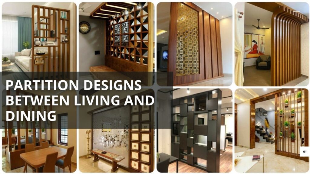
About Future Stiles Future Stiles is a relatively new player in the tile industry, but it has quickly gained recognition for its innovative and modern designs. The brand focuses on merging cutting-edge technology with artistic craftsmanship to create unique and visually appealing tiles. Facebook Twitter Instagram Linkedin Latest Post Partition Designs Between Living and Dining Areas 2024 Open floor plans have become a thing in the contemporary interior design both for residential and commercial spaces. They enhance openness, light penetration as well as interaction between people. Nonetheless, while we adore the feeling of expansiveness that an open plan gives us, in practice we often find ourselves needing to somehow demarcate and separate different functional areas within it, such as the living room and dining room. Partition designs between living and dining spaces offer an effective solution, striking a balance between maintaining an open feel and providing a sense of distinction and purpose to each area. In this article, we will discuss many partition design ideas that do not only serve functional purposes but also add beauty to your interiors. Why Consider Partition Designs? Partition designs are about more than just splitting space; they aim at creating unity and flow among various zones of function. Here is why you might consider having partitions between your living room and dining area: Spatial Definition: Partitions help clearly define where one area ends and another begins, which is particularly useful in open concept homes that need order. Aesthetic Enhancement: A well-chosen partition can act as a focal point or design element, which will add interest to your interiors when properly chosen. Functional Versatility: Some partitions can also serve as storage units, display shelves, or even art installations, thereby making the space both practical and attractive. Privacy and Noise Control: Partitions offer privacy and noise control between living room and dining room areas that may be required in busy homes Types of Partition Designs Different needs, styles and spatial configurations have led to a wide variety of partition designs. Some popular options include: 1. Glass Partitions Glass partitions are contemporary elegance for dividing living or dining areas while maintaining the openness of layout. They create brightness through enabling light passage. Examples of how glass partitions might be used include: These give a modern and minimalist look suitable for up-to-date houses. They offer a clear view while subtly separating the spaces. Frosted or Tinted Glass: If you desire more privacy, frosted or tinted glass may be used. This type of glass still allows light to filter through but obscures the view between the areas. Glass with Metal Frames: Industrial-style interiors can benefit from glass partitions with metal frames, which add a touch of ruggedness while maintaining transparency. 2. Wooden Partitions Wooden partitions bring warmth and a natural element to your living space. They can range from traditional to contemporary, depending on the design: Wooden Slats: Vertical or horizontal wooden slats create a visual division while allowing some level of transparency. This design is versatile and can be used in both modern and rustic interiors. Carved Wooden Screens: Intricately carved wooden screens add a touch of luxury and cultural richness to the space. These are particularly popular in traditional or eclectic homes. Solid Wood Panels: For a more substantial division, solid wood panels can be used. These can be left plain or adorned with artistic carvings or inlays 3. Shelving Units It is not only a practical but also fashionable option to divide space using open shelves, this becomes even more necessary in small spaces which have multifunctionality as their primary design principle: Open Shelves: These shelving units are designed to accommodate decorative articles, books or plants while still maintaining the openness between the living and dining areas. Closed Cabinets: In some instances, partitions may be designated for the purpose of additional storage. Customization options include doors or drawers that are integrated into these compartments. Combination Units: A mixture of shelves that are open and have closed designs allows for both display purposes as well as storage alternatives that cater to different needs and styles. 4. Sliding Doors Opening up or closing off living areas is easy with sliding doors: Glass Sliding Doors: Glass sliding doors are ideal for modern or contemporary homes due to thier ability to maintain visual connectivity even when they are closed. Wooden Sliding Doors: When they are closed, wooden ones make a denser partition giving a traditional or rustic feel to the room. Barn Doors: For farmhouses and other rustic interior types, barn doors can be used as an alternative. They give character and hint on nostalgia all at once. 5. Curtains and Drapes If a more gentle and flexible method of dividing spaces is needed, use curtains and drapes as partitions: To let in sunlight and create a romantic mood, delicate curtains are made of thin fabric. They make space feel light and airy. Heavy Curtains: The heavy curtain can be pulled to separate the room into two halves and establish an intimate area. They also contribute to noise reduction between living and dining areas. Multiple Curtains: Different layers of curtains are used so as to control lighting, privacy, or even ambience in the room. 6. Metal Screens Metal screens are a bold modern choice for partitioning spaces; they can be designed in different patterns or finishes: Laser-Cut Metal Screens: These screens can be customized with intricate patterns creating a striking visual effect but still allow some level of transparency. Perforated Metal Panels: Metal panels that have holes punched on them give a more industrial look and provide an opportunity to create semi-transparent divisions between two different areas. Metal Grilles: Geometric or artful grilles made of metal serve as contemporary divisions with identity of their own that add utility along with beauty Download Catalogue Creative Partition Ideas Partition designs which are different from the most common one can be used in a number of creative ways to define space between your living and dining areas. Below are some innovative suggestions.
Pantone Color of the Year 2024: Apricot Crush

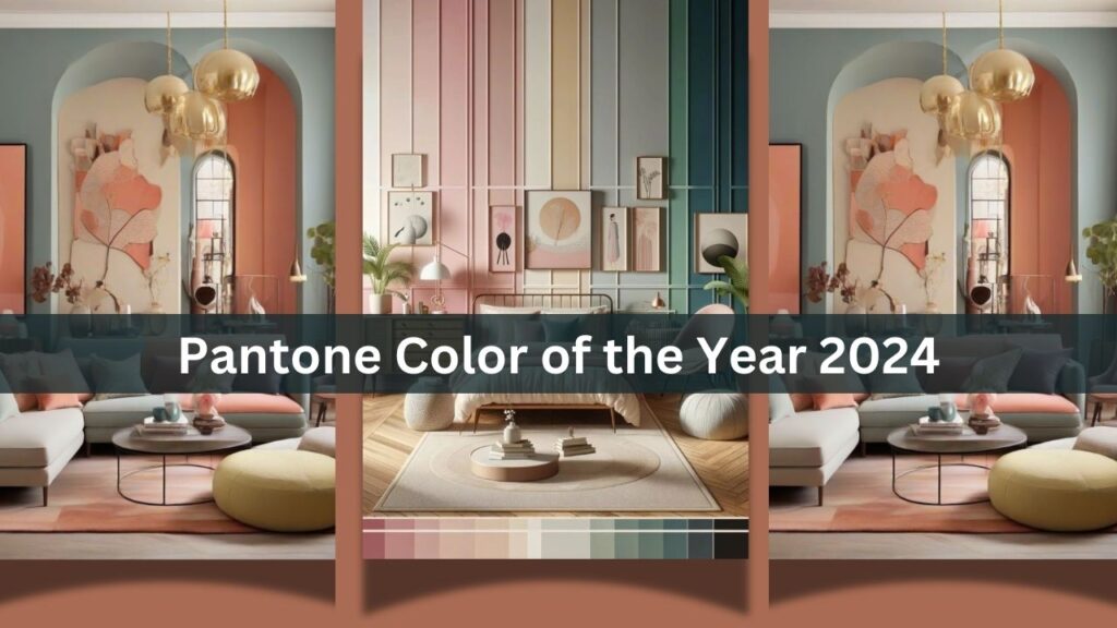
About Future Stiles Future Stiles is a relatively new player in the tile industry, but it has quickly gained recognition for its innovative and modern designs. The brand focuses on merging cutting-edge technology with artistic craftsmanship to create unique and visually appealing tiles. Facebook Twitter Instagram Linkedin Latest Post Pantone Color of the Year 2024: Apricot Crush The Pantone Color Institute declares its Colour of the Year annually, consequently determining designing, fashion and cultural trends worldwide. The hue for 2024 is not just a colour but also an embodiment of worldwide sentiments, dreams as well as feelings of today. The Pantone Color of the Year 2024 is “Apricot Crush” – a warm vivacious shade that bridges optimism with serenity. Moreover, this paper will delve into why Apricot Crush holds great meaning to different industries and how you can bring in this dynamic hue to your life either through interior design or fashion or personal expression. The Selection Process: How Pantone Chooses Its Color of the Year But before we delve into how Apricot Crush has affected the world around us let’s see how Pantone came up with it’s Color of the Year. The selection process though rigorous and insightful is based on an extensive examination of global trends, socio-political climates, and emerging influences across various fields. Global Trend Analysis: Pantone has analysts who monitor technology, fashion, art and entertainment trends as well as social media. They do this by examining different color trends in various parts of the world and how these colours define the prevailing mood. Socio-Political Context: The choice of color is often a reflection of global socio-political climate. For example, when situations are unsettled, softer and soothing colors may be chosen whereas brighter colors might indicate an optimistic or promising period. Cultural Influence: The Colour of the Year is also influenced by cultural shifts. This encompasses happenings in the art industry, global occurrences and even society’s overall emotional state. Industry Feedback: Pantone works with several industries such as fashion design, interior décor and product manufacturing to find out what people think about certain colors. Hence instead of capturing what is already happening at present in society only; it gives a glimpse into where society could be going. Apricot Crush: The Colour of 2024 Apricot Crush is a warm hue that looks like it could be orange or peach; it has a comforting feel to it that is only slightly dissipated by its undertones making it undoubtedly perfect for many applications due to the mixture between firmness associated with orange and serenity related to peach which allows it to be adaptable across different uses all over. Symbolic and Emotional impact: Apricot Crush symbolizes hope, revival and toughness. In a world that has passed through hard tests, this color shows the collective aspiration to move forward with positive thinking. It is a reminder that even in times of adversity there is warmth and beauty. Versatility in Design: Apricot Crush is a versatile shade that can be matched with various colors. With neutral tones such as beige or cream, it exudes a soft elegant look or strong shades like teal and navy for more contrast. It is loved by many designers because of its adaptability. Nature’s Influence: This colour reminds one of the earth—think warm colours at dawn, blushes on ripe fruit or fine petals on flowers. It evokes images of natural beauty and the simplest pleasures available in life. The Influence of Apricot Crush Across Industries Apricot Crush, being Pantone Color of the Year, will have an effect on different industries including fashion industry, interior décor sector, consumer goods among others in 2024 as hereunder: Fashion and Apparel Pantone Color of the Year usually catches up with fashion industry promptly. Apricot Crush’s nice warmth makes it suitable for both spring/summer and autumn/winter collections. Designers are likely incorporating Accessories: Handbags, footwear, and jewelry of this hue will be hot sellers because they provide people with a quiet touch of color that draws the eye too. Clothes: Apricot Crush is likely to be available in various materials, going from a flowing gown to a formal coat. Street Style: It will probably feature prominently in street wear as an adaptable color which fashion influencers and fashionistas like to combine it with denim material, black or any basic colors. Interior Design and Home Decor In interior design, color has the ability to establish space’s ambiance. Apricot Crush is set to become one of the best for creating warm and inviting spaces in 2024. Domestic Spaces: In lounges, bedrooms and dining places highlight with Apricot Crush. It looks good together with greys for example beige and white by adding warmth without overwhelming the room. Kitchen & Dining Areas: The tone can be included in kitchen cupboards; behind sinks; on walls of dining rooms for instance. This warm undertone creates an inviting atmosphere suitable for family gathering points. Decorative Accessories: For home décor objects such as cushions, throw pillows, artwork and pottery pieces. You can easily bring this trendy color into your house using apricot crush Beauty and Cosmetics Apricot Crush is likely to be featured in beauty industry trends for 2024 such as nail polish, make-up palettes and even hair colour. Makeup: This shade suits most skin tones, its presence can be expected in lipsticks, blushes and eye shadows which will become natural looking and healthy. Nail Polish: A warm hue that offers a fresh change from the usual pinks and reds in nail salons. Hair Colour: Those in search of uniqueness could try Apricot Crush among other hair colour trends for an adventurous look of their own Consumer Goods and Packaging Brands usually use the Pantone Color of the Year to revamp their packaging and product design hence connecting with consumers by creating a modern appearance. Product Design: Expect Apricot Crush to appear in product designs across industries aimed at younger customers who appreciate new trends. Packaging: On the shelf, this color can help products stand out thanks to its warm tones
